
How to Use the WADesk Dashboard for Team Performance Analytics
Viewing the Data Dashboard
Navigation Path: Team Admin Console -> left sidebar -> Data Dashboard
The Dashboard is the core page for managers to view overall team operations. It aggregates key metrics such as customer growth, message volume, and member activity, and supports filtering by time period and member — helping managers quickly assess team status and identify underperforming members.
Set Filter Conditions
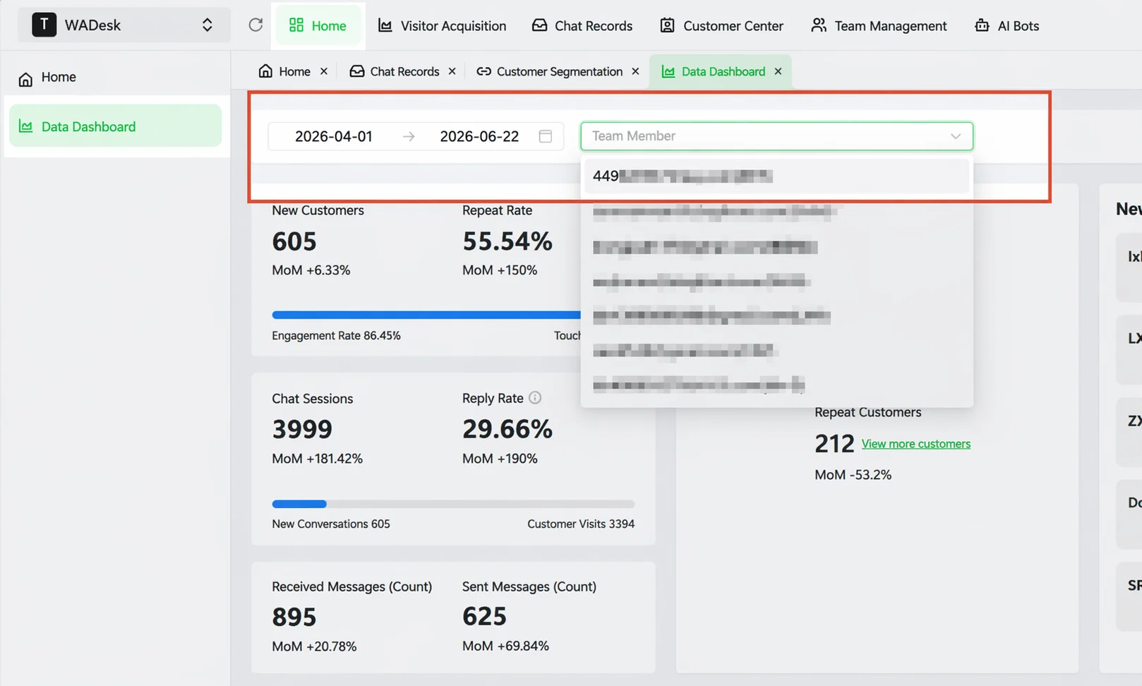
After entering the Dashboard, two filters are available at the top of the page:
Time Range: Click the date range picker to set the start and end dates. All numbers and charts below refresh accordingly.
Team Members: By default, aggregated data for the entire team is displayed. To view data for a specific member, select that member from the Team Members dropdown — the charts and table will only show that member's data.
View the Core Metrics Dashboard
Below the filter area is a row of data cards displaying key metrics for the selected time period.
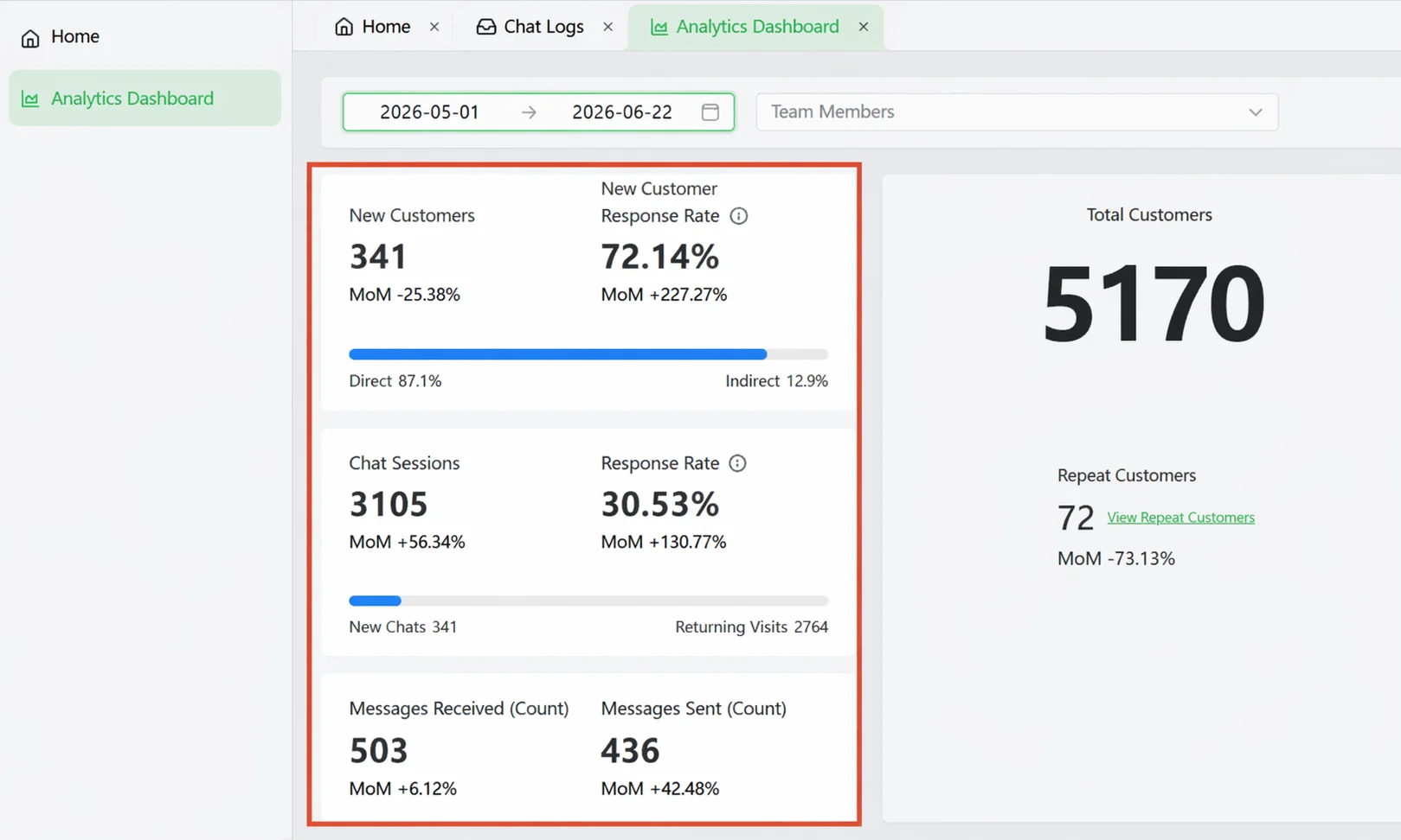
Here is what each metric means:
| Metric | Meaning | How to Use It |
|---|---|---|
| New Customers | Number of new customers added during the period. Customers includes two types: (1) WhatsApp accounts with conversation history; (2) WhatsApp accounts assigned as leads but without conversation history yet | Measure acquisition efficiency. The card also shows the proportion bar for "Inbound" (customers reaching out) and "Outbound" (proactive outreach). |
| New Customer Reply Rate | Among new customers, how many received a reply from a sales rep (the denominator includes leads assigned but not yet messaged) | Measure sales follow-up coverage for new customers. A low rate means new customers are not being attended to. |
| Chat Sessions | Total number of conversations during the period | Measure communication activity. Also shows the proportion of new vs. returning customer conversations. |
| Chat Reply Rate | Among sessions with conversations, the proportion where a sales rep replied | Measure sales responsiveness to existing conversations. |
| Messages Received | Total messages received from customers during the period | Reflects customer engagement. |
| Messages Sent | Total messages sent by sales reps during the period | Reflects proactive communication volume. |
New Customer Reply Rate answers "Is anyone following up with new customers?"
Chat Reply Rate answers "Is anyone replying to existing conversations?"
View Trend Line Charts
Below the metrics dashboard is a trend line chart showing indicator changes over time. The X-axis represents dates, the Y-axis represents values, and different colored lines represent different members.
Switch Metrics: Click the tabs above the chart to switch between the following 6 dimensions:
| Dimension | Meaning |
|---|---|
| Total Customers | Daily cumulative customer volume change |
| New Customers | How many new customers were added each day |
| Messages Sent | Daily message volume sent by sales reps |
| Messages Received | Daily message volume received from customers |
| Online Duration | Daily time sales reps were online (in minutes) |
| Average Response Time | Average time for a sales rep to reply to a customer message |
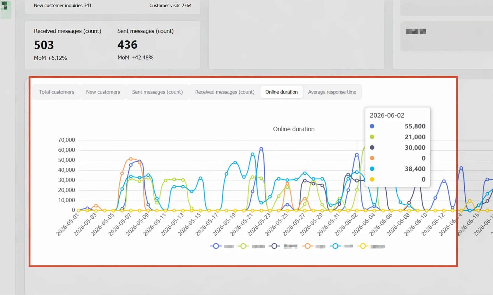
Focus on specific members: When the team is large, chart lines can be dense. Click member legends at the bottom of the chart to show or hide specific lines, keeping only the 2-3 members you want to compare for easier insight.
View specific daily values: Hover over a data point on the line to see detailed values for all members on that day.
View Data Table Details
Below the line chart is the Data Table, displaying detailed figures for each member (or each day) in table format for precise comparison.
Switch data dimension: The Data Dimension dropdown at the top right of the table offers two perspectives:
- Member Account: Each row is a member, allowing horizontal comparison of all members within the same time period.
- Time (Day): Each row is a date, allowing vertical observation of daily data changes over a period.
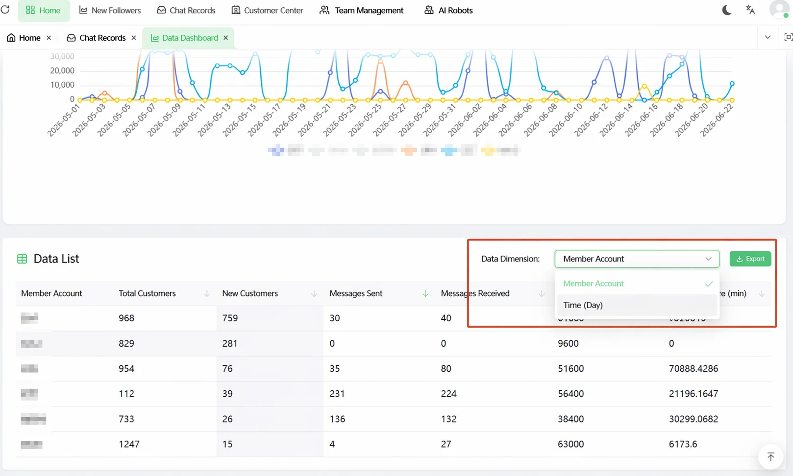
The table columns include: Member Account, Time (Day), Total Customers, New Customers, Messages Sent, Messages Received, Online Duration, Average Response Time. Click the arrow in any column header to sort in ascending or descending order.
Export Data
To export data for reporting or further analysis, click the Export button at the top right of the data table. The system downloads the current table data as an Excel file.
The exported data scope is based on the current filter conditions — if you filtered for a specific member's data only, only that member's data will be exported.
View and Handle Duplicate Customers
The core metrics dashboard includes a Duplicate Customers card, which counts how many times the same customer has been added by multiple sales reps within the team. Duplicate customers mean multiple reps are following up with the same person — this wastes resources and may cause the customer to receive multiple duplicate messages from the same company, hurting their experience.
Click the View Duplicate Customers link inside the card to open the duplicate customer list:
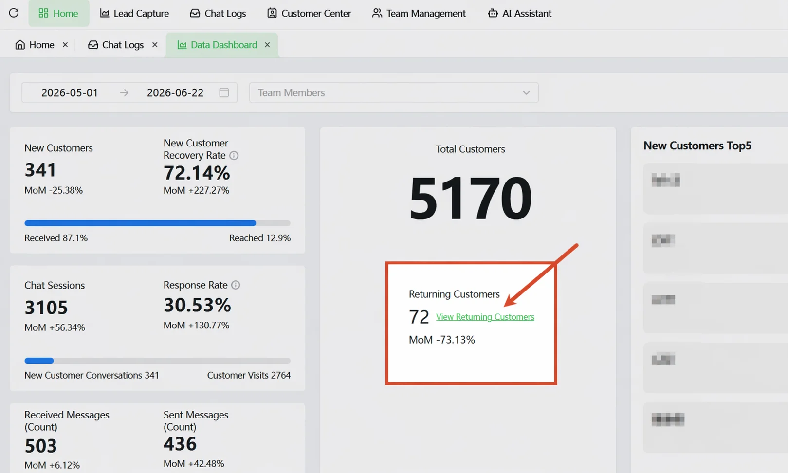
The list supports search by follower account/nickname, filtering by team member, and filtering by time range, making it easy to locate specific customers or members with duplication issues.
After reviewing, the manager can decide which sales rep continues the follow-up based on communication history and notify others to stop contacting that customer, reducing duplicate follow-ups at the source.
Important Notes
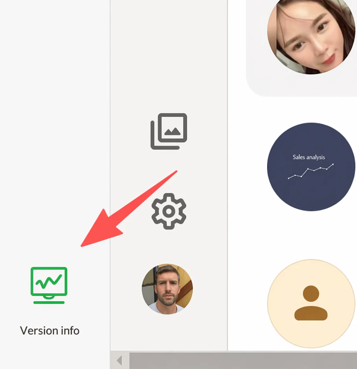
⚠ The Dashboard is displayed in the Team Admin Console only — it is not available in the Desktop Client. Access it by clicking the version number area in the bottom left of the Desktop Client or by opening the Team Admin Console in a browser.
⚠ All data is subject to the top filter conditions. If the data looks incorrect, first check whether the time range and member filter are set correctly.
⚠ Online Duration tracks the time a sales rep remains logged into the Desktop Client.
FAQ
Q: What is the difference between the Dashboard and the Desktop Client Home Dashboard? A: The Desktop Client Home Dashboard is the sales rep's personal view — it only shows their own account's data. The Dashboard is the manager's view, showing aggregated data for the entire team or a specific member. Both pull from the same data source but have different display scopes.
Q: The duplicate customer count is high — how should I handle it? A: Click View Duplicate Customers to enter the list. Find customers with high duplication counts and check the Belongs To column — this shows which members have duplicated this customer along with their latest communication times. Based on the communication history, decide which sales rep should continue the follow-up, then notify others to stop. To reduce duplication at the source, use Split Links to automatically assign new customers to specific sales reps, preventing multiple people from adding the same customer simultaneously.
Q: Can I export data for a single member only? A: Yes. First select that member in the top filter area, then click the Export button at the top right of the data table. The resulting Excel file will only contain that member's data. If you don't filter by member, the export includes aggregated details for the entire team.